
The Ultimate Guide To Responsive Web Design

What Is Responsive Web Design?
Responsive web design is a term used for coding a website to provide optimal viewing experience whether viewing on desktop, tablet or phone. A mobile responsive website places its emphasis on text readability and overall user experience through the reduction of pinching, zooming and scrolling.
How it’s Made
A mobile responsive website is carefully built by establishing rules to which modules on a site adhere to. These rules, called breakpoints, are defined within the Custom Style Sheets of the website and delineate pixel width ranges that tell the website how to behave on different devices. Every element in a responsively designed site needs to be adjusted - from images, to navigation components, to button size. Take a look at the diagram below to see how items would display in a responsive setup.
Benefits of Responsive Web Design
The primary objective of a mobile responsive website is to ease usability. With a mobile optimized site, your design can fit into virtually any device. Additionally, mobile optimization provides a heavy focus on being suitable for all ages. Large text size, easy to interpret icons, and imagery focused content ensure that visitors are more likely to stay longer and come back time and time again.
Outside of user experience, a mobile responsive website results in a variety of SEO related benefits. Dubbed “Mobilegeddon”, in April of 2015, Google announced that mobile responsive websites would be positively impacted in mobile search results. With Google dominating the largest share of the Search Engine Market, this is not something to be ignored. Conversely, those websites who did not heed to Google’s warning, were severely penalized when this change went into effect and saw a significant impact on mobile traffic.
E-commerce sites also reap many benefits from a responsive site. If you have ever tried to purchase an online product from your mobile device, you know that it can sometimes be an arduous process. Multiple studies have found that conversion rates increase with the development of a mobile responsive website. Product layout, large calls to action and a simplified checkout process all attribute to a visitor efficiently using your site.
One final item to consider is that a responsive website makes the old problem of having two separate websites (desktop and mobile) a thing of the past. Years ago, two versions of a website were used to accommodate for desktop and mobile viewing. Yes, that means two copies of the site, twice the price, and twice the time to update. As a result, separate website versions also earned half the SEO value. With a mobile responsive website, all of the heavy lifting is done once while creating the framework, but any copy and aesthetic changes apply to all viewports.
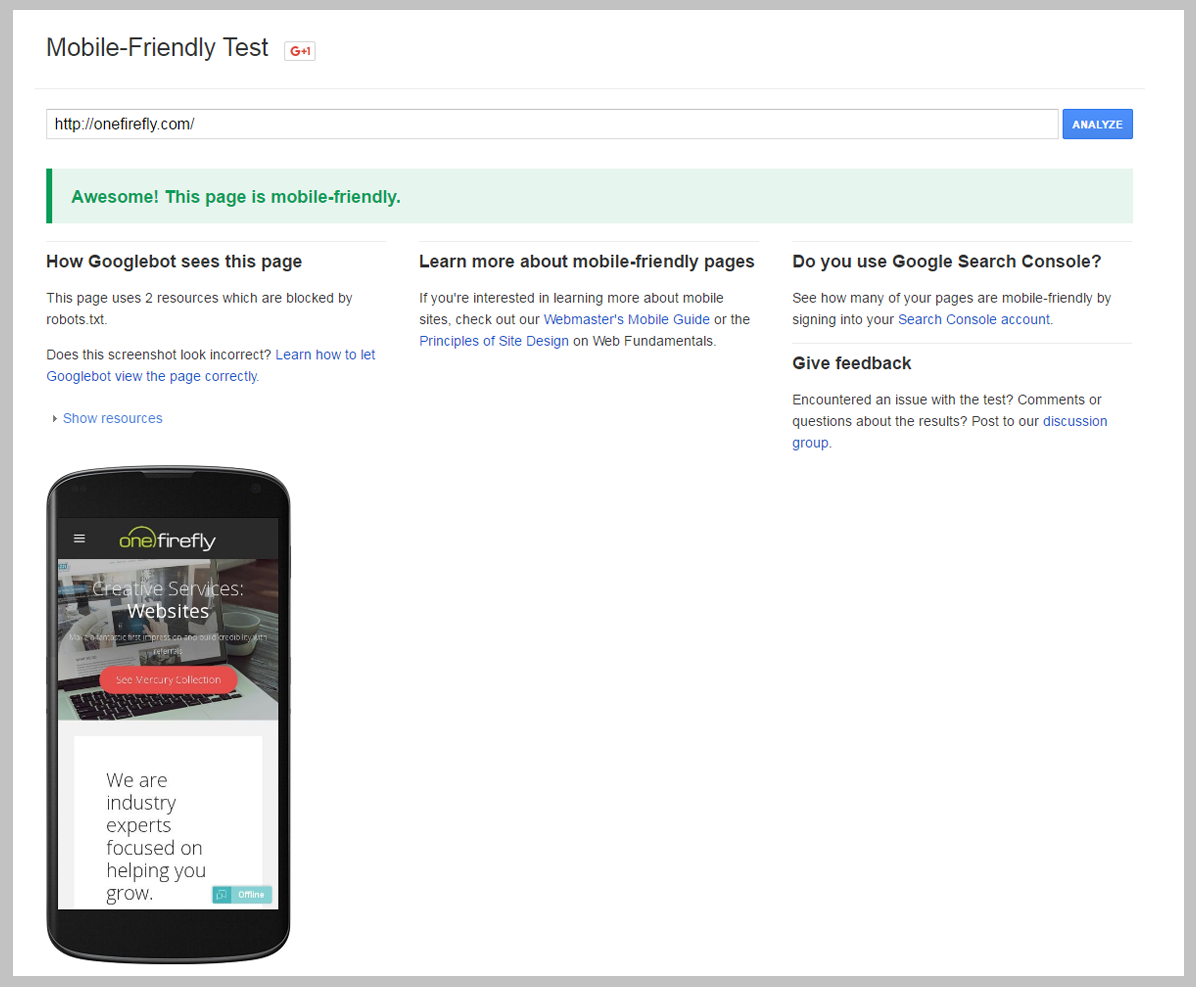
Is My Site Mobile Responsive?
Google has created a tool for you not only to analyze your URL but to provide feedback and recommendations on how you can improve visitors user experience.
Did you take the mobile responsive test? Let us know your results in the comments below!